What’s on the card
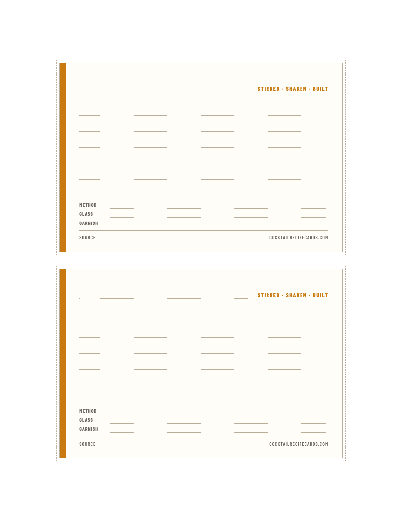
The same layout as every classic on this site, with the spec left empty: six ruled lines for the ingredients (or notes), then Method, Glass, Garnish, and a Source line on the footer. The coloured strip on the left is amber on the blank; on the classics it’s the method colour (blue for stirred, coral for shaken, green for built), and there’s nothing stopping you colouring the edge with a marker to do the same.
Two cards per page, sized so they fit a standard 4×6 recipe box or a photo sleeve.
How to use it
- Write the ratio in the corner. For any sour, “2 / 1 / ¾” is the thing you’ll actually read with a shaker in your hand. The full spec is for when you’ve forgotten which is which.
- Put the source on the footer line. “Death & Co, p. 141” or “Anders Erickson, Feb video” is the difference between a recipe and a recipe you can go back and check.
- One card per version. If you tweak a drink, write a second card rather than crossing things out. The crossed-out card is the one you’ll want when the tweak turns out to be worse.
- Use a spare line for the verdict. “Too sweet, try ½ oz” is the most valuable sentence on the card and the one nobody writes.
Print settings
US Letter, scale 100%, margins none, card stock. The dotted lines are cut guides and don’t print. If your printer forces a margin, the cards still fit; they’ll just sit slightly off-centre.